As educators, we are constantly swimming in a sea of student data. Daily exit tickets, check-ins, reading running records, and skills-based assessments flood our desks every single week. We know how crucial it is to spot when a student is stalling or when they are suddenly accelerating—but let’s be honest: staring at rows of raw numbers on a Friday afternoon rarely gives us that instant clarity.
To make matters more complicated, traditional spreadsheet charts are bulky. They take up half the screen, require constant resizing, and don’t align nicely when you want to look at your classroom roster line-by-line.
What if you could turn rows of messy chronological logs into mini, dynamic trendline charts that live directly inside a single spreadsheet cell? Today, we are going to build a live Sparkline Skill Tracker Dashboard. No complex software, no paid extensions, and absolutely no programming code required. Just pure spreadsheet magic that will give you a “quick view” of student growth in less than a second.
The Live Training Template (Follow Along!)
This article is designed to be a hands-on training workshop. To get the most out of it, we highly recommend opening up a clean Google Sheet right alongside this post so you can practice building the formulas in real-time, or even type in a few pieces of your own classroom data!
To make this easy, here is a set of basic, realistic classroom data based on a standard 1-4 rubric growth scale:
| Date | Skill Tracked | Rubric Score (1-4) | Student Note |
|---|---|---|---|
| 2026-10-01 | Critical Analysis | 1 | Needs heavy scaffolding |
| 2026-10-02 | Evidence Writing | 2 | Attempting basic citations |
| 2026-10-05 | Critical Analysis | 2 | Identified main theme |
| 2026-10-06 | Code Debugging | 2 | Found syntax error |
| 2026-10-08 | Evidence Writing | 2 | Consistent formatting |
| 2026-10-12 | Critical Analysis | 2 | Developing supporting arguments |
| 2026-10-15 | Code Debugging | 1 | Struggled with logic loop |
| 2026-10-19 | Evidence Writing | 3 | Strong integration of source quotes |
| 2026-10-22 | Critical Analysis | 3 | Independent connection making |
| 2026-10-26 | Code Debugging | 3 | Successfully resolved logic loop |
| 2026-10-29 | Evidence Writing | 4 | Flawless execution of advanced rubric |
Setting Up Your Two-Section Spreadsheet Headers
Teachers don’t log data neatly by skill area; they log it chronologically down a column as the days go by. If a student logs a different skill on every row, a standard trend chart becomes a jagged, meaningless line because it mixes apples and oranges.
To fix this, we are going to use the Dynamic Dashboard Model. This setup creates two clear visual areas on your sheet:
- The Data Log Columns (Columns A–D): Your chronological diary where you quickly type in data daily as it happens.
- The Dashboard Summary Columns (Columns F–G): Where our magic formulas live to sort the data and display the clean, isolated visual charts.
Set up your spreadsheet Row 1 headers exactly like this:
- Column A: Date
- Column B: Skill Tracked
- Column C: Rubric Score (1-4)
- Column D: Student Note
- (Leave Column E completely blank as a visual buffer block!)
- Column F: Skill Summary
- Column G: Dynamic Sparkline
Now, to make our summary work, type your three core skills directly into the cells under Column F:
- In cell F2, type:
Critical Analysis - In cell F3, type:
Code Debugging - In cell F4, type:
Evidence Writing
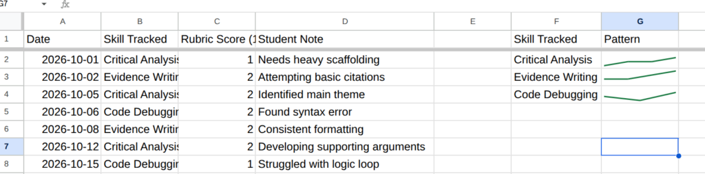
[Screenshot Placeholder 1]: An image showing Columns A through D acting as the raw data log, and Columns F and G acting as the Summary Dashboard area with the explicit headers visible in Row 1.
Step 1: Isolate the Data Using FILTER
Before drawing a chart, we need to tell the spreadsheet to look through our messy chronological log, ignore everything else, and pull out only the numbers associated with a specific skill. We do this using the FILTER function.
Click on cell G2 (right next to your “Critical Analysis” label in cell F2) and check out how this target formula functions:
=FILTER(C$2:C, B$2:B = F2)What is happening here?
C$2:C: This tells the sheet to look at your raw score column to pull its data. (The$signs lock the rows in place so you can drag the formula down later!).B$2:B = F2: This is our filter condition. It scans your raw skill column (Column B) and filters out only the rows where the text matches cell F2 (“Critical Analysis”).
If you press Enter, you will see a clean list of numbers spill down into the column—reflecting just that student’s progression over time for that specific skill.
Step 2: Wrap It in a SPARKLINE
Now that we have isolated a clean list of scores, we want to compress that list into a beautiful line chart contained inside that single cell. We do this by wrapping our filter formula directly inside the SPARKLINE function.
Update your formula in cell G2 to look like this:
=SPARKLINE(FILTER(C$2:C, B$2:B = F2), {"charttype","line";"color","#1B7A43";"linewidth",2})What is happening here?
SPARKLINE(...): This function takes the array of numbers provided by our filter and instantly draws a smooth trendline."charttype","line": Explicitly tells the sheet to design a fluid line chart."color","#1B7A43": Swaps out the default gray line for a vibrant growth-mindset forest green color."linewidth",2: Bumps up the thickness of the line slightly so it’s clean and easy to read on small screens.
[Screenshot Placeholder 2]: An image showing the single cell G2 rendering a clean green trendline, demonstrating clear upward visual growth based on the Critical Analysis sample scores.
Step 3: Establish a Consistent Scale (Crucial Step!)
There is one hidden trap with standard sparklines: by default, they auto-scale to the lowest and highest numbers in the data group. If a student moves from a 3 to a 4 on a rubric scale, an unscaled sparkline will make it look like they shot up to the moon because 3 is treated as the lowest baseline!
To ensure your charts are accurate and honest, we need to force the cell to always display a fixed baseline of 1 and a ceiling of 4.
Modify your formula in cell G2 one final time to lock in your rubric scale bounds:
=SPARKLINE(FILTER(C$2:C, B$2:B = F2), {"charttype","line";"color","#1B7A43";"linewidth",2;"ymin",1;"ymax",4})What is happening here?
"ymin",1: Explicitly forces the bottom floor of the chart to represent a rubric score of 1."ymax",4: Explicitly forces the top ceiling of the chart to represent a perfect rubric score of 4.
Now, click the tiny blue square in the bottom-right corner of cell G2 and drag it down across cells G3 and G4. The formula will adjust automatically to read the labels in F3 and F4, generating flawless scaled trends for “Code Debugging” and “Evidence Writing”!
Scaling Up: How to Track Your Whole Roster
Right now, you have built a fantastic dashboard for a single student. But how do we scale this out for an entire classroom roster without building fifty different spreadsheets? You have two incredible options depending on how you like to work:
Option A: The Tab-per-Student Duplicate Method
If you want to keep things simple, get this master sheet setup sounding exactly the way you want it for one student. Then, look down at your sheet tab bar at the bottom, right-click the tab name, and select Duplicate. Rename the new tab to your next student’s name, clear out the old log data in columns A-D, and start typing in new logs. The dashboard formulas on the right side will stay completely intact and track the new data automatically!
Option B: The “Data-Dump” Master Sheet + QUERY Method (The Pro Way!)
If you don’t want to click through dozens of different tabs to log data throughout the day, you can get a little tricky and utilize a centralized logging system. Add a new column at the very front of your sheet (Column A) labeled Student Name. Now, use this single “Master Log” tab to write down every entry for every student in your room sequentially as they happen.
Next, you create individual tabs for each student. But instead of typing data there, you use a powerful spreadsheet engine function called QUERY in cell A1 of that student’s tab. You write a short command that says: “Go look at the Master Log and pull over only the rows where the Student Name column matches this student.”
Once the query pulls the isolated data onto that student’s tab, your SPARKLINE dashboard on the right reads that filtered stream and visualizes their growth perfectly! One central logging spot, unlimited automated student views.
Ready to Master the QUERY Function?
If that master log setup sounds like the exact automation efficiency upgrade your grading workflow needs, I have you covered. I have packaged a complete, step-by-step breakdown into my completely free Educator’s Guide to QUERY.
This free guide cuts through the technical jargon and gives you the exact copy-and-paste formulas you need to build dynamic rosters, filter student profiles instantly, and completely supercharge your digital dashboards. Click here to download your free Educator’s Guide to QUERY now!
How are you planning to leverage sparklines or master logs to streamline data analysis in your classroom this school year? Let’s discuss your design ideas in the comments below!